
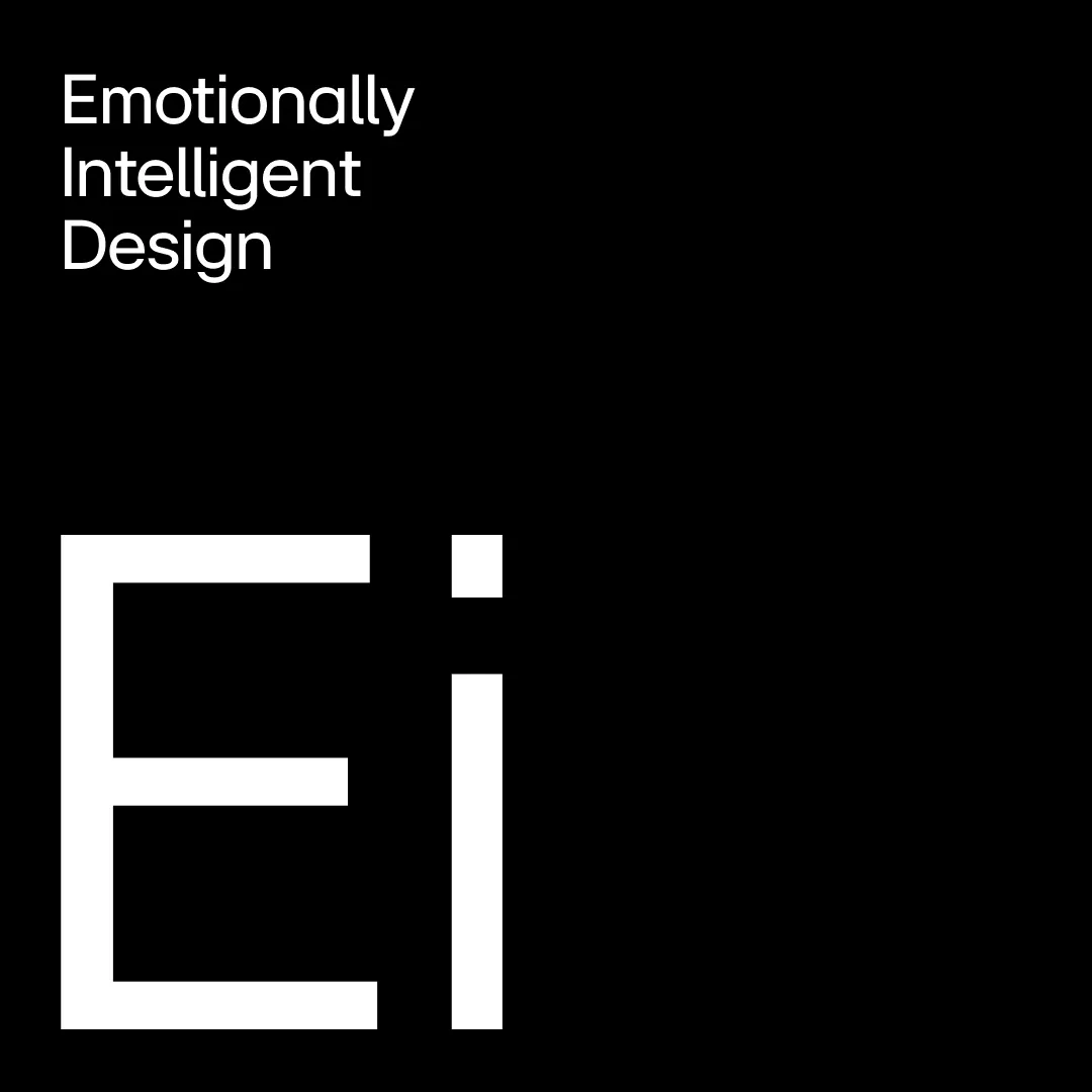
Emotional Intelligent Design
Every popular brand come with their own brand design language such as Apple's Human Interface Design, Google's Material Design 3, and Microsoft's Fluent Design System 2.
Introduce LG brand visual design language - Emotionally Intelligent Design.
The brand to "bring a smile back to the world of technology" and aims to "put some personality into technology".
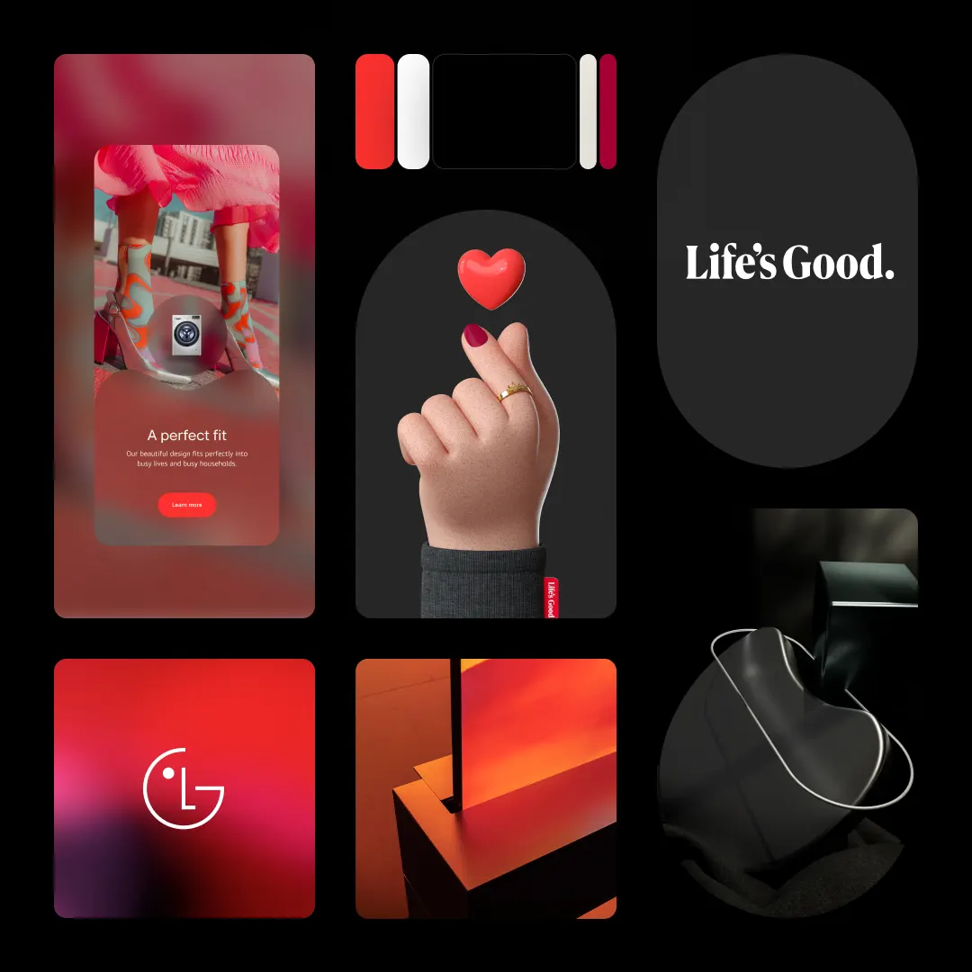
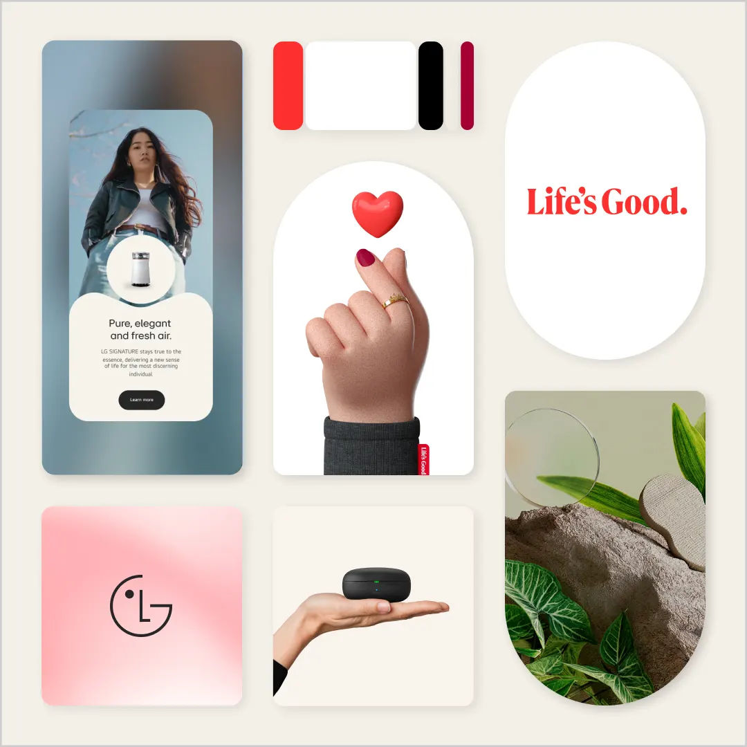
The Life's Good typography was inspired by various LG products to make it stand out more, and the period at the end conveys LG's confidence and sincerity in its mission to make people's lives better through innovation. However, the slogan is not just about hope and positivity; it represents LG’s commitment to making life better and more valuable and serves as a declaration of what life should strive to be. LG’s products and services are designed to align with this aspiration, even in challenging times.
The design system inspired by the shapes of LG's home appliances. This is called Emotionally Intelligent forms.
It is divided into core states and connected states, expressing a static and fluid form. The layout used to represent the elements that connect with each other is like the combination of oil.
The New LG EI Font
The LG EI font is a dedicated typeface that communicates our design philosophy of 'Emotionally Intelligent Design'. The overall form of the font is geometric, and the external circle represents the LG innovative technology
The rounded edges inside the font and the strokes inspired by handwriting symbolize the elements of warmth and emotion we aspire to embody.
Focus on Gen Z
The new sophisticated and dynamic way of expressing LG brand so that future customers like Gen Z can arelate to Life's Good's values. When we asked young customers about LG brand, they say, 'LG is the home appliance. I built trust by experiencing LG Electronics at home that my parents generation bought.' Through this brand reinvent, we are trying to instill a friendly image of 'a brand that I love' and 'a brand that I can play with' beyond the existing 'brand that my parents trust and use'.
Three core values: 'Uncompromising Customer Experience', 'Human-centred Innovation' and 'Warmth to Power a Smile'. This reinvention of the brand introduces a younger and more dynamic visual identity that resonates more deeply with consumers across all generations and backgrounds. The transformation is part of its plans to become a global iconic brand, recognising the need to go beyond products and services and effectively communicate its brand values to customers.
New Active Red Colour
New Active Red colour introduced on top of the original Heritage Red.
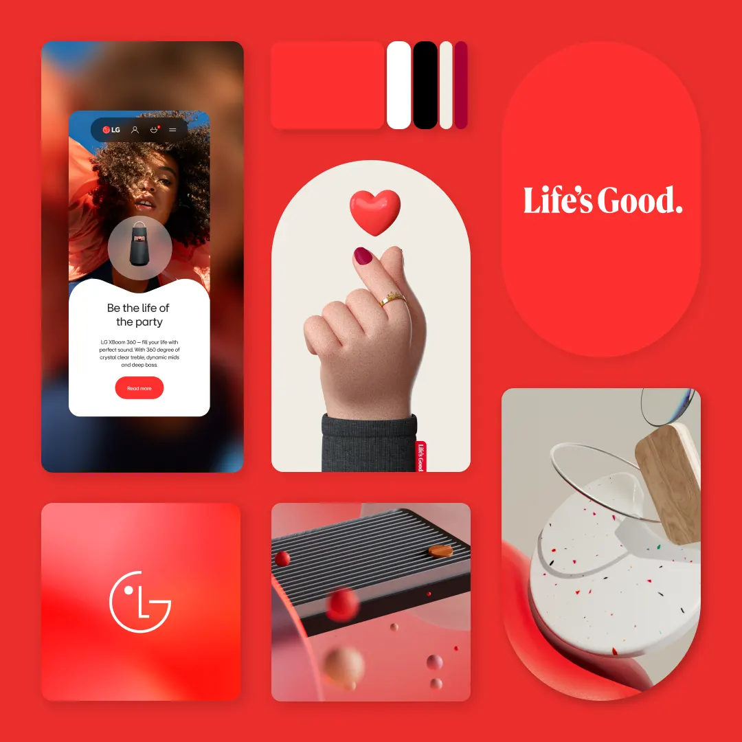
In order to express LG Electronics' 'Heritage Red' brand colour in a more youthful and sophisticated way, LG introduced a new 'LG Active Red' that is more visible. While retaining the characteristics of the existing LG Electronics symbol of the face of the future.
New Warm Grey Colour
When we think of IT companies, we often think of a technology-driven, logical, cold image. LG want to promote the 'warmth' unique to LG Electronics.
LG Electronics is a company that has such warmth that it has a culture of "Caring". We take care of not only the technical aspects but also the small details to make their lives more meaningful. In the future, we will see many LG Electronics unleashing such warm technology. In addition, it reflects the brand's commitment to pursuing high standards without compromise in product quality and customer experience, and to always think hard and strive to make LG's innovations more meaningful to customers, even if they are small, rather than just "innovation for innovation's sake."
Designer's Eye
Full of personality, our smiling logo signals humanity and intelligence.
New LG logo brought to life with emotion and interaction. It moves with a warm and witty attitude, is designed for the future and adapts to consumers' moods and needs.
For consistent and rapid cognition, LG will continue to use the traditional LG logo. The recently unveiled digital logo play focuses on interactivity. It introduces the symbol's movement in various situations, such as when the logo appears, when listening to music, when winking, and more.
LG Characters - Joy & Ryder
Newly created mascots, LG characters, 'Joy' and 'Ryder', represent a small nod to the heritage of the LG business and with intricate details in their clothing and accessories, as well as bringing an optimistic and youthful spirit of the brand to the forefront.
The characters will also be used as social stickers, along with bespoke finger heart and hand heart gestures, providing a nod to Korean culture and symbolising warmth and optimism to the world.
Fashion Brand Easter Egg
LG also formerly known as Goldstar, founded in 1958, played a huge role in LG's history.
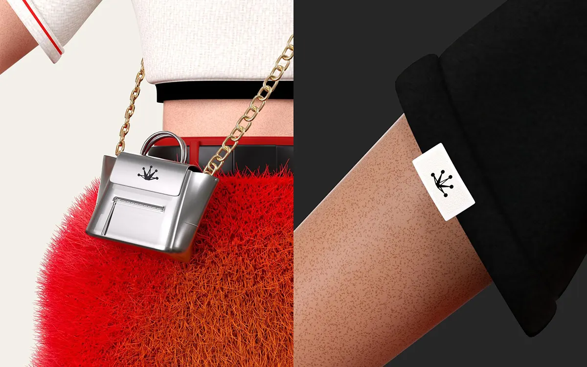
Goldstar brand's merchandise will probably used in future LG's fashion brand!
Lucky + Goldster = LG
Inspired from LG old name, Goldstar. The "Goldstar" brand will revive and become LG's future fashion brand.
LG 3D Billboard Showcase
LG new branding went live with an anamorphic 3D billboard in Times Square New York.
LG commits to sharing the 'Life's Good' message with customers, inspiring and encouraging them to embrace life with optimism. Given the rising uncertainty and instability worldwide due to post-pandemic shifts, the campaign aims to motivate customers, spreading a positive influence and reinforcing the company's unwavering belief that 'Life’s Good.'
Life's Good
LG is a powerhouse of smart home appliances that is changing our lifestyles. When you think of LG, you think of 'people' and 'smiles'.
LG brand Reinvent is creating an important moment together that marks a milestone in the history of LG Electronics. Let's look forward to seeing what the LG Electronics brand will look like in 3~5 years.
In the future, LG Electronics will take a step forward to become an iconic brand that is loved by people all over the world, so please watch and support us.


